
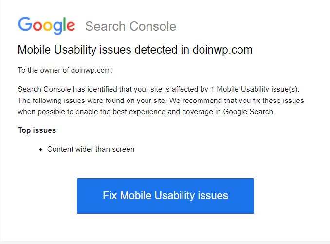
Your WordPress website has been set up, you’ve installed a decent theme and bunch of plugins, added some content, added your website to the Google Search Console and sooner or later you get a notification in your e-mail about “content wider than screen” issue:
First and common thing to do is to check the problematic page by visiting it from a mobile device (or a mobile device emulator – e.g. Google Chrome Developer Tools) to see if it really has these issues. Further below you can read about the most common causes of this error along with the easy solutions how to fix it.
How to fix the “Content Wider Than Screen” issue:
If there are no other layout problems in your WordPress theme, then usually this error could be caused by one of the following reasons:
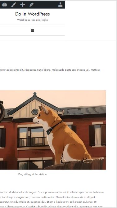
You’ve added an image with caption to your website page (like you see the ones above)
When you embed an image in your page and add a caption to it, WordPress by default places this image along with its caption in a container and adds a style attribute to it with a static width defined. While this has been implemented by WordPress to solve some problems with floated images, I know for a fact, that unless there is a very special need (e.g. critical CSS inline-all approach), you must run from any kind of inline styles in your HTML like from the devil.
This static width – if the image is wider than your screen could break the page layout by pushing the content out of the screen viewport boundaries. Luckily this problem can be fixed by adding one simple line of code in your theme functions.php file:
add_filter( 'img_caption_shortcode_width', '__return_false' );
Which will remove the static width from the image container and make the page mobile friendly again.
You face a common Google Search Console glitch
If you are receiving e-mails about “Mobile Usability issues”, but at the same when running the Mobile-Friendly Test everything comes up fine and you do not see any visual problems with your website pages, then you’re probably facing an infamous Google Search Console glitch with generating false-positive Mobile Usability reports.
With the Google “Mobile Usability” reports and Mobile-Friendly Test tool retiring on December 1, 2023, this becomes less actual anyway, but maybe adjusting the website to avoid these false positives now, will come to your advantage in future.
The trick behind the glitch is that Google’s automated Mobile Usability reports have their own crawling budgets and different testing phases which apparently happen at different times. When Google is crawling the page for a report, sometimes it stops in the middle and does not crawl each and every resource the page depends on, including CSS files. If your page contains images that initially are wider than the viewport of a mobile device (let’s guess – a width of 320-360px) and Google does not crawl the CSS file responsible for auto-adjusting the image width to maximum device viewport width – the “Mobile Usability” test will fail because of “Content being wider than the screen”. And that is exactly what happens in those cases!
Solution for this problem is to include this “critical CSS” snippet directly into the HTML head tag of your pages:
<style>
 :where(body, iframe, pre, img, svg, video, canvas, select) {
 max-width: 100%;
 overflow: auto;
 word-break: break-word;
 }
 </style>
Which acts as a fall-back or “Critical CSS” solution to auto-adjust the width for the images and other elements in case the page doesn’t get fully crawled.
There is too long words or urls in the content
One of the most common cases with CSS is when your website contains comment or feedback forms where the site visitors can update the page content by posting their comments and reviews. All it takes for someone to mess up the layout for your page is to post a comment with long enough word or url in it, which all goes in one line. It does not even have to be visitor – it could also happen accidently when you’re updating the site content and forgetting to test it on mobile. Luckily in most cases you can solve this with the same code snippet I mentioned above – or just use the:
word-break: break-word;
statement for the HTML elements you’re facing the issues with.
Example:
onelongwordonehellofalongwordonehellofalonglongwordthiswordistoolongtofitinthecontentandwillcausethemobileusaiblityissuesonsiteswhichdonotusewordbreaktosplitthelongwordshoweverwithapropercssstylingthiswordshouldbesplitintomultiplelines
In the mentioned example you see a very long word which originally should mess up the layout of this page with causing “Content wider than screen” issue. The WordPress theme I’m using also had this glitch (with splitting the long words), but the code snippet for “Google Search Console” glitch solved it.
You use tables in your content
There is often a need to add tables in the content to represent some statistical data or comparsions and the problem with tables is that they almost always does not fit into smaller screens causing a page content going wider than the screen. There is a simple recipe how to solve these problems: All you need to do is add a wrapper tag around the table (usually a div or figure tag) with an “overflow-x” CSS attribute set to “auto” (this will enable horizontal scrolling for the table when needed).
HTML:
<figure class="table-wrapper">
<table>
<tr><th>First Column name</th><th>Second Column name</th><th>Third Column name</th><th>Fourth Column name</th></tr>
<tr><td>First Column data</td><td>Second Column data</td><td>Third Column data</td><td>Fourth Column data</td></tr>
</table>
</figure>
CSS:
.table-wrapper {
overflow-x:auto;
display:block;
}
PRACTICAL EXAMPLE:
| First Column name | Second Column name | Third Column name | Fourth Column name | Fifth Column name | Sixth Column name | Seventh Column name | Eighth Column name | Ninth Column name | Tenth Column name |
|---|---|---|---|---|---|---|---|---|---|
| First Column data | Second Column data | Third Column data | Fourth Column data | Fifth Column data | Sixth Column data | Seventh Column data | Eighth Column data | Ninth Column data | Tenth Column data |
| First Column data | Second Column data | Third Column data | Fourth Column data | Fifth Column data | Sixth Column data | Seventh Column data | Eighth Column data | Ninth Column data | Tenth Column data |